
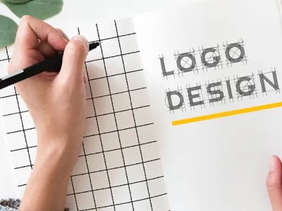
Your Logo Is Your Brand’s First Impression. Don’t Get It Wrong.
In the split second that a potential customer sees your logo — on a business card, a website, a social media profile, or the side of a vehicle — they form an opinion about your business.
Is it professional? Is it trustworthy? Does it feel relevant to what they need?
A great logo answers yes to all three questions instantly. A poorly designed logo raises doubts before you’ve even said a word.
After 16+ years of designing logos and brand identities for businesses across India, I’ve seen the same mistakes repeated over and over — by startups, established businesses, and even some agencies. Here are the five most damaging logo design mistakes and exactly how to avoid them.
Mistake 1: Choosing Too Many Colors
The Problem: Many businesses want their logo to “stand out” so they cram in 4, 5, or even 6 colors. The result is a logo that looks cluttered, confusing, and amateur — especially when printed in black and white or scaled down to small sizes.
The Rule: A strong logo uses a maximum of 2–3 colors. Think about the world’s most recognisable logos — Nike (black/white), Coca-Cola (red/white), Apple (silver/grey). Fewer colors create stronger visual identity.
The Fix: Choose a primary brand color and one supporting neutral. If you need a third color, use it sparingly as an accent only. Make sure your logo also works perfectly in single-color (black) format — because it will need to.
Mistake 2: Using Too Many Fonts
The Problem: Mixing three or four different typefaces in a logo is one of the fastest ways to make it look unprofessional. It creates visual chaos and signals to customers that your brand lacks consistency and discipline.
The Rule: A professional logo uses a maximum of two fonts — one for the primary wordmark and one for the tagline (if any). And ideally, they come from the same type family or are deliberately chosen to complement each other.
The Fix: Stick to one bold, distinctive font for your main name. If you have a tagline, pair it with a lighter weight of the same typeface or a simple sans-serif that complements it. Typography in logos should feel intentional, not decorative.
Mistake 3: Designing Only for Digital — Forgetting Print
The Problem: Many logos are designed on a screen and look great on a website or social media — but fall apart when printed on a business card, embroidered on a shirt, or printed on a vehicle. Fine details, gradients, and thin lines disappear at small sizes or in embroidery.
The Rule: A logo must work at every size — from a tiny 16×16 pixel favicon to a massive billboard. It must also work in print formats including single-color, embroidery, and engraving.
The Fix: Test your logo at multiple scales before finalising it. A professional logo should be delivered in vector format (AI, EPS, SVG) — not just PNG or JPEG — so it scales to any size without losing quality. Always test your logo on a white background, a dark background, and in black and white.
Mistake 4: Copying Trends Instead of Building Timelessness
The Problem: Design trends come and go fast. Logos with flat gradients, 3D bevels, or overly trendy geometric shapes often look dated within 3–5 years. Chasing trends in logo design is a trap — because a logo should ideally serve your brand for 10+ years.
The Rule: A great logo is timeless, not trendy. It communicates who you are at a fundamental level — through shape, color psychology, and typography — without relying on whatever design style is popular this year.
The Fix: Focus on what your brand stands for, not what looks fashionable right now. Invest in a logo that communicates your values and industry clearly. Simple, bold, and meaningful always outlasts complex, trendy, and decorative.
Mistake 5: Designing In-House Without Professional Input
The Problem: With tools like Canva and free logo generators now available, many small businesses are tempted to design their own logos to save money. The result is almost always a logo that looks generic, forgettable, and unprofessional — which costs far more in lost business than it saves in design fees.
The Rule: Your logo is not a one-time expense — it is a long-term brand asset. It appears on everything: your website, social media, business cards, invoices, packaging, signage, and merchandise. Getting it wrong from the beginning means rebranding costs down the line.
The Fix: Invest in a professional logo design. A qualified designer doesn’t just make something that “looks nice” — they research your industry, understand your competitors, study color psychology, and create a visual identity that strategically positions your brand. The return on that investment is felt every time a potential customer sees your brand and feels confident doing business with you.
What Makes a Logo Truly Great?
After designing 120+ brand identities, here’s my checklist for a logo that works:
✅ Simple — Instantly recognisable and easy to remember ✅ Versatile — Works at any size, on any background, in any color format ✅ Timeless — Built to last 10+ years without looking dated ✅ Relevant — Communicates your industry and personality at a glance ✅ Distinctive — Stands apart from competitors in your space
Final Thoughts
Your logo is not just an image — it’s the visual foundation of everything your brand communicates to the world. Getting it right from the start saves you time, money, and the frustration of rebranding later.
If your logo has any of the five problems above, it might be time for a brand refresh.
Thinking about a new logo or brand identity? Let’s talk. I’d love to help you create a brand that works as hard as you do.